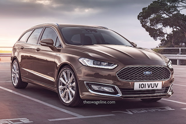
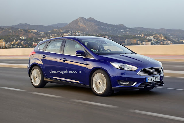
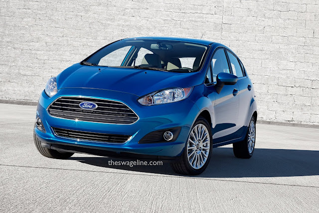
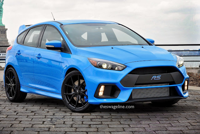
I like Ford's current 'design language' (hate that phrase), but I think that the badge would look better if it were placed in the middle of the grill instead of hovering about awkwardly above it. It's a small thing, but it really bothers me so I decided I would put it right.
I wanted my versions to give the impression of staring down the road, instead of gaping gormlessly at the sky. Another unintended benefit is that they look less like Aston Martins now, which may not sound like such a bad thing but it was one of the criticisms levelled at Ford when they first introduced their new corporate grill.
And here's a giant image that lets you compare my versions to the original cars. Click it to enlarge.
EDIT: What about having the RS badge placed centrally in the Focus RS's grill - either on the plastic section or the actual grill insert.

